Thursday, October 24, 2013

Table as an Image in R

Usually, it's best to keep tables as text, but if you're making a lot of graphics, it can be helpful to be able to create images of tables.

PNG table

Creating the Table

After loading the data, let's first use this trick to put line breaks between the levels of the effect variable. Depending on your data, you may or may not need or want to do this.

library(OIdata)
data(birds)
library(gridExtra)

# line breaks between words for levels of birds$effect:
levels(birds$effect) <- gsub(" ", "\n", levels(birds$effect))

Next let's make our table: 

xyTable <- table(birds$sky, birds$effect)

Now we can create an empty plot, center our table in it, and use the grid.table function from the gridExtra package to display the table and choose a font size.


plot.new()
grid.table(xyTable,
  # change font sizes:
  gpar.coltext = gpar(cex = 1.2),
  gpar.rowtext = gpar(cex = 1.2))

Now you can view and save the image just like any other plot.

The code is available in a gist.

Citations and Further Reading


Thursday, October 17, 2013

Line Breaks Between Words in Axis Labels in ggplot in R

Sometimes when plotting factor variables in R, the graphics can look pretty messy thanks to long factor levels. If the level attributes have multiple words, there is an easy fix to this that often makes the axis labels look much cleaner.

Without Line Breaks

Here's the messy looking example:
No line breaks in axis labels
And here's the code for the messy looking example:


library(OIdata)
data(birds)
library(ggplot2)

ggplot(birds,
  aes(x = effect,
    y = speed)) +
geom_boxplot()

With Line Breaks

We can use regular expressions to add line breaks to the factor levels by substituting any spaces with line breaks:

library(OIdata)
data(birds)
library(ggplot2)

levels(birds$effect) <- gsub(" ", "\n", levels(birds$effect))
ggplot(birds,
  aes(x = effect,
    y = speed)) +
geom_boxplot()

Line breaks in axis labels
Just one line made the plot look much better, and it will carry over to other plots you make as well. For example, you could create a table with the same variable.

Horizontal Boxes

Here we can see the difference in a box plot with horizontal boxes. It's up to you to decide which style looks better:

No line breaks in axis labels


Line breaks in axis labels

library(OIdata)
data(birds)
library(ggplot2)

levels(birds$effect) <- gsub(" ", "\n", levels(birds$effect))
ggplot(birds,
  aes(x = effect,
    y = speed)) +
geom_boxplot() + 
coord_flip()

Just a note: if you're not using ggplot, the multi-line axis labels might overflow into the graph.

The code is available in a gist.

Citations and Further Reading

Thursday, October 10, 2013

Custom Legend in R

This particular custom legend was designed with three purposes:
  • To effectively bin values based on a theoretical minimum and maximum value for that variable (e.g. -1 and 1 or 0 and 100)
  • To use a different interval notation than the default
  • To handle NA values
Even though this particular legend was designed with those needs, it should be simple to extrapolate from that to build legends based on other criteria.

Standard Legend

For this post, I'll be assuming you've looked through the Oregon map tutorial or have other experience making legends in R. If not, you'll probably want to check that link out. It's an awesome tutorial.

Let's start by creating a map with a standard legend, and then we move on to customization later.

First, we'll load the packages we need and the data from OIdata:

library(OIdata)
library(RColorBrewer)
library(classInt)

# load state data from OIdata package:
data(state)

Next we want to set some constants. This will save us a bunch of typing and will make the code easier to read, especially once we start creating a custom legend. Also, it will allow us to easily change the values if we want a different number of bins or a different min and max.

In this example, we're assuming we have a theoretical minimum and maximum and want to determine our choropleth bins based on that.

nclr <- 8 # number of bins
min <- 0 # theoretical minimum
max <- 100 # theoretical maximum
breaks <- (max - min) / nclr

Next, we'll set up our choropleth colors (this should look familiar from the Oregon tutorial):

# set up colors:
plotclr <- brewer.pal(nclr, "Oranges")
plotvar <- state$coal
class <- classIntervals(plotvar,
  nclr,
  style = "fixed",
  fixedBreaks = seq(min, max, breaks))
colcode <- findColours(class, 
  plotclr)

And now let's map the data:

# map data:
map("state", # base
  col = "gray80",
  fill = TRUE,
  lty = 0)
map("state", # data
  col = colcode,
  fill = TRUE,
  lty = 0,
  add = TRUE)
map("state", # border
  col = "gray",
  lwd = 1.4,
  lty = 1,
  add = TRUE)

And finally let's add our default legend:

legend("bottomleft", # position
  legend = names(attr(colcode, "table")), 
  title = "Percent",
  fill = attr(colcode, "palette"),
  cex = 0.56,
  bty = "n") # border

Here's the output of this code (see map-standard-legend.R in the gist):
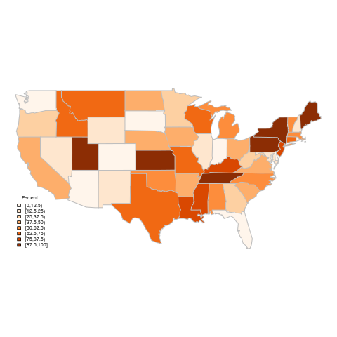
Percent of power coming from coal sources (standard legend)

Custom Legend

Next we want to add a few lines here and there to enhance the legend.

For starters, let's deal with NA values. We don't have any in this particular dataset, but if we did, we would have seen they were left as the base color of the map and not included in the legend.

After our former code setting up the colors, we should add the color for NAs. It's important that these lines go after all the other set up code, or the wrong colors will be mapped.

# set up colors:
plotclr <- brewer.pal(nclr, "Oranges")
plotvar <- state$coal
class <- classIntervals(plotvar,
  nclr,
  style = "fixed",
  fixedBreaks = seq(min, max, breaks))
colcode <- findColours(class, 
  plotclr)
NAColor <- "gray80"
plotclr <- c(plotclr, NAColor)

We also want to let the map know to have our NA color as the default color, so the map will use that instead of having those areas be transparent:

# map data:
map("state", # base
  col = NAColor,
  fill = TRUE,
  lty = 0)
map("state", # data
  col = colcode,
  fill = TRUE,
  lty = 0,
  add = TRUE)
map("state", # border
  col = "gray",
  lwd = 1.4,
  lty = 1,
  add = TRUE)

Next, we want to set up the legend text. For all but the last interval, we want it to say  n < (i + breaks). The last interval should be  n  (i + breaks). This can be accomplished by

# set legend text:
legendText <- c()
for(i in seq(min, max - (max - min) / nclr, (max - min) / nclr)) {
  if (i == max(seq(min, max - (max - min) / nclr, (max - min) / nclr))) {
    legendText <- c(legendText, paste(round(i,3), "\u2264 n \u2264", round(i + (max - min) / nclr,3)))
  } else
    legendText <- c(legendText, paste(round(i,3), "\u2264 n <", round(i + (max - min) / nclr,3))) 
}

But we also want to include NAs in the legend, so we need to add a line:

# set legend text:
legendText <- c()
for(i in seq(min, max - (max - min) / nclr, (max - min) / nclr)) {
  if (i == max(seq(min, max - (max - min) / nclr, (max - min) / nclr))) {
    legendText <- c(legendText, paste(round(i,3), "\u2264 n \u2264", round(i + (max - min) / nclr,3)))
    if (!is.na(NAColor)) legendText <- c(legendText, "NA")
  } else
    legendText <- c(legendText, paste(round(i,3), "\u2264 n <", round(i + (max - min) / nclr,3))) 
}

And finally we need to add the legend to the map:


legend("bottomleft", # position
  legend = legendText, 
  title = "Percent",
  fill = plotclr,
  cex = 0.56,
  bty = "n") # border

The new map (see map-new-legend.R) meets all the criteria we started with that the original legend didn't have.
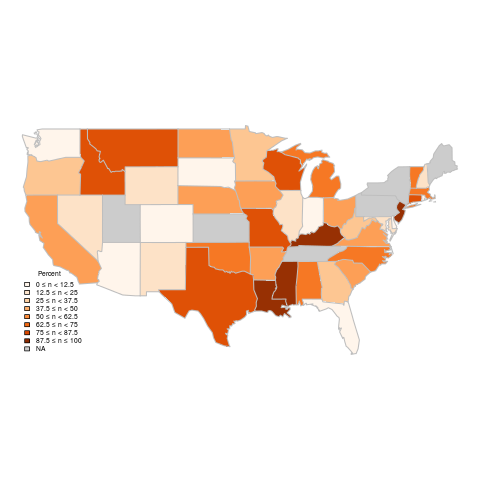
Percent of power coming from coal sources (custom legend)

Code is available in a gist.

Citations and Further Reading

Thursday, October 3, 2013

How to Set Up Your App on Shiny Beta Hosting

This is a short tutorial on how to create a web version of a Shiny app you've built once you've received access to the shiny hosting beta.

SSH: Setting Up Directories

To connect to your account, input this line into a terminal (obviously input your own username instead of "username"):

ssh username@spark.rstudio.com

It will prompt you for your password. Enter the password you received in the email.

Next, create a folder to put your first app in. Like the email says, you want to put this at ~/ShinyApps/myapp/. The "myapp" folder can be named whatever you want, but the "ShinyApps" folder needs to have that name.

mkdir ShinyApps
mkdir ShinyApps/myapp

SSH: Installing R Packages

Next, you can go ahead and install R packages, if you know which ones your application will need.

First, open R just like you would on your own computer:

R

Next, install a package (e.g. "maps"):

install.packages("maps", dependencies = TRUE)

It will ask you the following questions:

Would you like to use a personal library instead?  (y/n)
Would you like to create a personal library 
~/R/library 
to install packages into?  (y/n)

You can answer "y" to both of these. Your applications will be able to use packages installed here.

Then you can follow the standard procedure for installing R packages.

You can now exit ssh:

exit

Copying Files

On your own computer, navigate to the directory your Shiny application's folder is in, e.g.:

cd Shiny

Once you're there, you can copy the application folder to the server:

scp -r myapp/ username@spark.rstudio.com:ShinyApps/

Or if you don't want to copy all the files, you can move them one at a time:


scp myapp/ui.R username@spark.rstudio.com:ShinyApps/myapp/ui.R

Try It Out

Now you should be able to access your application at http://spark.rstudio.com/username/myapp/

You can now send it to all your friends or leave a link in the comments!