Thursday, February 21, 2013

Elevation Profiles in R

First, let's load up our data. The data are available in a gist. You can convert your own GPS data to .csv by following the instructions here, using gpsbabel.

gps <- read.csv("callan.csv",
  header = TRUE)

Next, we can use the function SMA from the package TTR to calculate a moving average of the altitude or elevation data, if we want to smooth out the curve. We can define a constant for the number of data points we want to average to create each moving average value.

If you don't want to convert meters to feet, a metric version of the code is available in the gist (callanMetric.R).

library(TTR)
movingN <- 5 # define the n for the moving average calculations
gps$Altitude <- gps$Altitude * 3.281 # convert m to ft
gps$SMA <- SMA(gps$Altitude,
  n = movingN)
gps <- gps[movingN:length(gps$SMA), ] # remove first n-1 points

Next, we want to calculate the distance of each point. You can skip this step if your dataset already includes distances.

library(sp)
Dist <- 0
for(i in 2:length(gps$Longitude)) {
  Dist[i] = spDistsN1(as.matrix(gps[i,c("Longitude", "Latitude")]),
    c(gps$Longitude[i-1], gps$Latitude[i-1]),
    longlat = TRUE) / 1.609 # longlat so distances will be in km, then divide to convert to miles
}
gps$Dist <- Dist

DistTotal <- 0
for(i in 2:length(gps$Longitude)) {
  DistTotal[i] = Dist[i] + DistTotal[i-1]
}
gps$DistTotal <- DistTotal

And finally, we can plot our elevation data using geom_ribbons and ggplot:

library(ggplot2)
ggplot(gps, aes(x = DistTotal)) +
geom_ribbon(aes(ymin = 600, # change this to match your min below
    ymax = SMA),
  fill = "#1B9E77") + # put your altitude variable here if not using moving averages
labs(x = "Miles",
  y = "Elevation") +
scale_y_continuous(limits = c(600,1200)) # change this to limits appropriate for your region

Elevation profile in ggplot2

Code and data available in a gist.

Thursday, February 14, 2013

GPS Basemaps in R Using get_map

There are many different maps you can use for a background map for your gps or other latitude/longitude data (i.e. any time you're using geom_path, geom_segment, or geom_point.)

get_map

Helpfully, there's just one function that will allow you to query Google Maps, OpenStreetMap, Stamen maps, or CloudMade maps: get_map in the ggmap package. You could also use either get_googlemap, get_openstreetmap, get_stamenmap, or get_cloudmademap, but instead you can just use get_map for the same functionality as all of those combined. This makes it easy to try out different basemaps for your data.

You need to supply get_map with your location data and the color, source, maptype, and zoom of the base map.

Let's go ahead and map the trails in Elwyn John Wildlife Sanctuary here in Atlanta. The csv data and R file are available in a gist.

gps <- read.csv("elwyn.csv",
  header = TRUE)

library(ggmap)
mapImageData <- get_map(location = c(lon = mean(gps$Longitude),
  lat = 33.824),
  color = "color", # or bw
  source = "google",
  maptype = "satellite",
  # api_key = "your_api_key", # only needed for source = "cloudmade"
  zoom = 17)

pathcolor <- "#F8971F"

ggmap(mapImageData,
  extent = "device", # "panel" keeps in axes, etc.
  ylab = "Latitude",
  xlab = "Longitude",
  legend = "right") +
  geom_path(aes(x = Longitude, # path outline
  y = Latitude),
  data = gps,
  colour = "black",
  size = 2) +
  geom_path(aes(x = Longitude, # path
  y = Latitude),
  colour = pathcolor,
  data = gps,
  size = 1.4) # +
# labs(x = "Longitude",
#   y = "Latitude") # if you do extent = "panel"

We'll be changing the four lines marked above in orange to change what basemap is used.

source = "google"

get_map option source = "google" (or using get_googlemap) downloads a map from the Google Maps API. The basemaps are © Google. Google Maps have four different maptype options: terrain, satellite, roadmap, and hybrid.

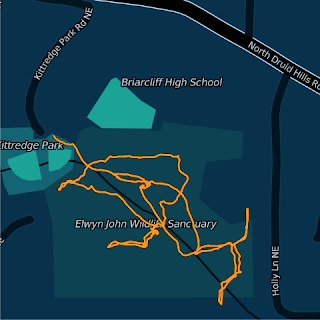
source = "google", maptype = "terrain"
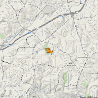
source = "google", maptype = "terrain", zoom = 14
Max zoom: 14

source = "google", maptype = "satellite"
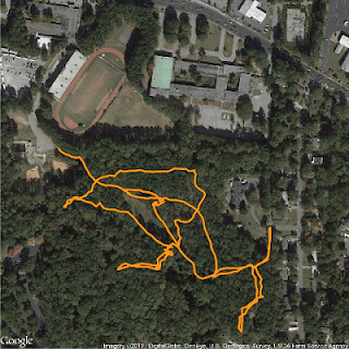
source = "google", maptype = "satellite", zoom = 17
Max zoom: 20

source = "google", maptype = "roadmap"
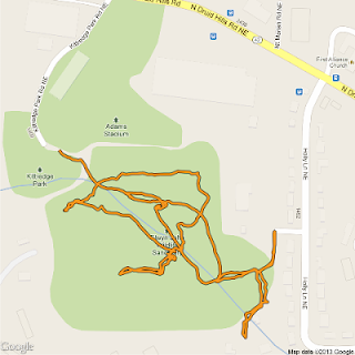
source = "google", maptype = "roadmap", zoom = 17

source = "google", maptype = "hybrid"

Hybrid combines roadmap and satellite.
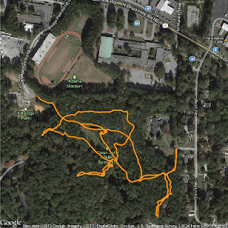
source = "google", maptype = "hybrid", zoom = 17
Max zoom: 20

source = "osm"

get_map option source = "osm" (or using get_openstreetmap) downloads a map from OpenStreetMap. These maps are Creative Commons licensed, specifically Attribution-ShareAlike 2.0 (CC-BY-SA). This means you are free to use the maps for commercial purposes, as long as you release your final product under the same Creative Commons license. OpenStreetMap has no maptype options.

source = "osm" (no maptype needed)
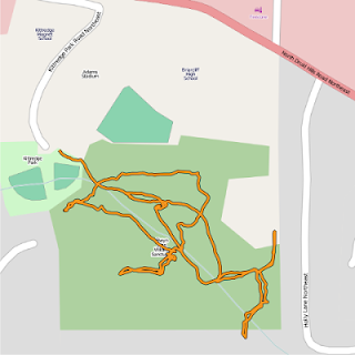
source = "osm", zoom = 17

Max zoom: 20

source = "stamen"

get_map option source = "stamen" (or using get_stamenmap) downloads a map from Stamen Maps. The map tiles are by Stamen Design, licensed under CC BY 3.0. The data for Stamen Maps is by OpenStreetMap, licensed under CC BY SA. Stamen has three different maptype options: terrain, watercolor, and toner.

source = "stamen", maptype = "terrain"
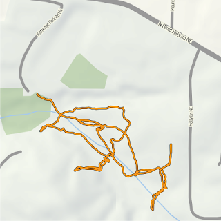
source = "stamen", maptype = "terrain", zoom = 17
Max zoom: 18

source = "stamen", maptype = "watercolor"
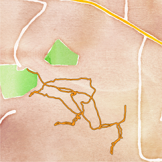
source = "stamen", maptype = "watercolor", zoom = 17
Max zoom: 18

source = "stamen", maptype = "toner"
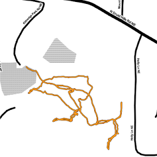
source = "stamen", maptype = "toner", zoom = 17
Max zoom: 18

source = "cloudmade"

CloudMade styles build on top of OpenStreetMap data. Thousands of CloudMade styles are available. You can browse them on the CloudMade site. You can also make your own styles.

To use CloudMade map styles in R, you will first need to get an API key to insert into your R code so it can access the maps. You can get an API key from the CloudMade site.

Here are just a couple examples of CloudMade basemaps:
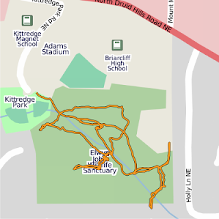
source = "cloudmade", maptype = 1, api_key = "your_key_here", zoom = 17

Style: The Original
Author: CloudMade
source = "cloudmade", maptype = 67367, api_key = "your_key_here", zoom = 17

Style: 10Scape-2
Author: Romeady Adi
Max zoom: 18

The code and data are available in a gist.

Thursday, February 7, 2013

Get Citrix XenDesktop to Work on Linux

I had some difficulty figuring out how to get Citrix XenDesktop to work properly on Linux.

I was having the same problem I had had on Windows — when I would try to access XenDesktop, the browser would try to download launch.ica instead of running it.

Citrix Receiver

However, on other operating systems, I had always downloaded the Citrix Online Plug-in to fix the problem. For some reason, the Citrix Online Plug-in is not available for Linux. However, the Citrix Receiver is available for Linux, and seems to do the same thing.

After installing Citrix Receiver, your browser will ask for your permission to run it.

Citrix Receiver for Linux needs your permission to run.


Open Motif

You may need to install Open Motif before you can install Citrix Receiver.

If so, download Open Motif, extract it, and follow the directions in INSTALL.configure, namely:

cd
./configure
make check
make install
make clean

Security Certificate

SSL error: Contact your help desk with the following information: You have not chosen to trust "AddTrust External CA Root", the issuer of the server's security certificate (SSL error 61).


If you try to log on to your virtual desktop and get an error about "AddTrust External CA Root", you can just do
sudo cp /usr/share/ca-certificates/mozilla/*.* /opt/Citrix/ICAClient/keystore/cacerts/


References


Thursday, January 31, 2013

Using Line Segments to Compare Values in R

Sometimes you want to create a graph that will allow the viewer to see in one glance:
  • The original value of a variable
  • The new value of the variable
  • The change between old and new
One method I like to use to do this is using geom_segment and geom_point in the ggplot2 package.

First, let's load ggplot2 and our data:

library(ggplot2)

data <- as.data.frame(USPersonalExpenditure) # data from package datasets
data$Category <- as.character(rownames(USPersonalExpenditure)) # this makes things simpler later

Next, we'll set up our plot and axes:

ggplot(data,
 aes(y = Category)) +
labs(x = "Expenditure",
 y = "Category") +

For geom_segment, we need to provide four variables. (Sometimes two of the four will be the same, like in this case.) x and y provide the start points, and xend and yend provide the endpoints.

In this case, we want to show the change between 1940 and 1960 for each category. Therefore our variables are the following:
  • x: "1940"
  • y: Category
  • xend: "1960"
  • yend: Category
geom_segment(aes(x = data$"1940",
  y = Category,
  xend = data$"1960",
  yend = Category),
 size = 1) +

Next, we want to plot points for the 1940 and 1960 values. We could do the same for the 1945, 1950, and 1955 values, if we wanted to.

geom_point(aes(x = data$"1940",
 color = "1940"),
 size = 4, shape = 15) +
geom_point(aes(x = data$"1960",
 color = "1960"),
 size = 4, shape = 15) +

Finally, we'll finish up by touching up the legend for the plot:

scale_color_discrete(name = "Year") +
theme(legend.position = "bottom")

geom_segment, then geom_point

The order of geom_segment and the geom_points matters. The first geom line in the code will get plotted first. Therefore, if you want the points displayed over the segments, put the segments first in the code. Likewise, if you want the segments displayed over the points, put the points first in the code.

For example, we could change the middle section of the code to:

geom_point(aes(x = data$"1940",
 color = "1940"),
 size = 4, shape = 15) +
geom_point(aes(x = data$"1960",
 color = "1960"),
 size = 4, shape = 15) +

geom_segment(aes(x = data$"1940",
  y = Category,
  xend = data$"1960",
  yend = Category),
 size = 1) +

And the output would look like:
geom_point then geom_segment


Similarly, if you have points that will be overlapping, make sure you think about which of the point lines you want R to plot first.

The code is available in a gist.

Thursday, January 24, 2013

Storing a Function in a Separate File in R

If you're going to be using a function across several different R files, you might want to store the function in its own file.

If you want to name the function in its own file

This is probably the best option in general, if only because you may want to put more than one function in a single file.

Next, let's make our function in the file fun.R:

mult <- function(x, y) {
    x*y
}

If you get the warning message "In readLines(file) : incomplete final line found on 'fun.R'", just insert a line break at the end of the fun.R file.

If you want to name the function in the file running it

First let's make the same function (but this time unnamed) in the file times.R:

function(x, y) {
    x*y
}

Calling the functions

And finally we'll make a file file.R to call our functions:

times <- dget("times.R")
times(-4:4, 2)

source("fun.R")
mult(-4:4, 2)

Note: if you are used to using source to run your R code, note that in this case we are using the source command within a file.


All files are available as a gist.

Thursday, January 17, 2013

Calculating a Gini Coefficients for a Number of Locales at Once in R

The Gini coefficient is a measure of the inequality of a distribution, most commonly used to compare inequality in income or wealth among countries.

Let's first generate some random data to analyze. You can download my random data or use the code below to generate your own. Of course, if you generate your own, your graphs and results will be different from those shown below.

city <- c("A", "B", "C", "D", "E", "F", "G", "H", "I", "J")
income <- sample(1:100000,
 100,
 replace = TRUE)
cities <- data.frame(city, income)

Next, let's graph our data:

library(ggplot2)
ggplot(cities,
 aes(income)) +
 stat_density(geom = "path",
  position = "identity") +
 facet_wrap(~ city, ncol = 2)

Histogram of each city's incomes
Your results will differ if using random data

The Gini coefficient is easy enough to calculate in R for a single locale using the gini function from the reldist package.

library(reldist)
gini(cities[which(cities$city == "A"), ]$income)

But we don't want to replicate this code over and over to calculate the Gini coefficient for a large number of locales. We also want the coefficients to be in a data frame for easy use in R or for export for use in another program.

There are many ways to automate a function to run over many subsets of a data frame. The most straightforward in our particular case is aggregate:

ginicities <- aggregate(income ~ city,
 data = cities,
 FUN = "gini")
names(ginisec) <- c("city", "gini")


> ginisec
   city      gini
1     A 0.2856827
2     B 0.3639070
3     C 0.3288934
4     D 0.1863783
5     E 0.3565739
6     F 0.2587475
7     G 0.3022642
8     H 0.3795288
9     I 0.3311034
10    J 0.2496933


And finally, let's go ahead and export our data using write.csv:


write.csv(ginicities, "gini.csv",
 row.names = FALSE)


While you're at it, you might want to try using other functions on your dataset, such as mean, median, and length.

The full code is available in a gist.

Citations and Further Reading

Thursday, January 10, 2013

Stacked Bar Charts in R

Reshape Wide to Long

Let's use the Loblolly dataset from the datasets package. These data track the growth of some loblolly pine trees.

> Loblolly[1:10,]
   height age Seed
1    4.51   3  301
15  10.89   5  301
29  28.72  10  301
43  41.74  15  301
57  52.70  20  301
71  60.92  25  301
2    4.55   3  303
16  10.92   5  303
30  29.07  10  303
44  42.83  15  303

First, we need to convert the data to wide form, so each age (i.e. 3, 5, 10, 15, 20, 25) will have its own variable.

wide <- reshape(Loblolly,
 v.names = "height",
 timevar = "age",
 idvar = "Seed",
 direction = "wide")

> wide[1:5,]
  Seed height.3 height.5 height.10 height.15 height.20 height.25
1  301     4.51    10.89     28.72     41.74     52.70     60.92
2  303     4.55    10.92     29.07     42.83     53.88     63.39
3  305     4.79    11.37     30.21     44.40     55.82     64.10
4  307     3.91     9.48     25.66     39.07     50.78     59.07
5  309     4.81    11.20     28.66     41.66     53.31     63.05

Create Variables

Then we want to create new columns showing how much each tree has grown between data points. For example, instead of knowing a tree's height at age 10, we want to know how much it's grown between age 5 and age 10, so that can be a bar in our graph.

wide$h0.3 <- wide$height.3
wide$h3.5 <- wide$height.5 - wide$height.3
wide$h5.10 <- wide$height.10 - wide$height.5
wide$h10.15 <- wide$height.15 - wide$height.10
wide$h15.20 <- wide$height.20 - wide$height.15
wide$h20.25 <- wide$height.25 - wide$height.20

Plot Stacked Bar Chart

Finally, we want to plot all the new data points:

library(RColorBrewer)
sequential <- brewer.pal(6, "BuGn")
barplot(t(wide[,8:13]),
 names.arg = wide$Seed, # x-axis labels
 cex.names = 0.7, # makes x-axis labels small enough to show all
 col = sequential, # colors
 xlab = "Seed Source",
 ylab = "Height, Feet",
 xlim = c(0,20), # these two lines allow space for the legend
 width = 1) # these two lines allow space for the legend
legend("bottomright", 
 legend = c("20-25", "15-20", "10-15", "5-10", "3-5", "0-3"), #in order from top to bottom
 fill = sequential[6:1], # 6:1 reorders so legend order matches graph
 title = "Years")

Stacked bar chart
If you decide you'd rather have clustered bars instead of stacked bars, you can just add the option beside = TRUE to the barplot.

The full code is available in a gist.

Citations and Further Reading