- To effectively bin values based on a theoretical minimum and maximum value for that variable (e.g. -1 and 1 or 0 and 100)
- To use a different interval notation than the default
- To handle NA values
Standard Legend
For this post, I'll be assuming you've looked through the Oregon map tutorial or have other experience making legends in R. If not, you'll probably want to check that link out. It's an awesome tutorial.
Let's start by creating a map with a standard legend, and then we move on to customization later.
First, we'll load the packages we need and the data from OIdata:
library(OIdata)
library(RColorBrewer)
library(classInt)

# load state data from OIdata package:
data(state)
Next we want to set some constants. This will save us a bunch of typing and will make the code easier to read, especially once we start creating a custom legend. Also, it will allow us to easily change the values if we want a different number of bins or a different min and max.
In this example, we're assuming we have a theoretical minimum and maximum and want to determine our choropleth bins based on that.
nclr <- 8 # number of bins
min <- 0 # theoretical minimum
max <- 100 # theoretical maximum
breaks <- (max - min) / nclr
Next, we'll set up our choropleth colors (this should look familiar from the Oregon tutorial):
# set up colors:
plotclr <- brewer.pal(nclr, "Oranges")
plotvar <- state$coal
class <- classIntervals(plotvar,
  nclr,
  style = "fixed",
  fixedBreaks = seq(min, max, breaks))
colcode <- findColours(class,
  plotclr)
And now let's map the data:
And finally let's add our default legend:
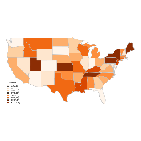
Here's the output of this code (see map-standard-legend.R in the gist):
For starters, let's deal with NA values. We don't have any in this particular dataset, but if we did, we would have seen they were left as the base color of the map and not included in the legend.
After our former code setting up the colors, we should add the color for NAs. It's important that these lines go after all the other set up code, or the wrong colors will be mapped.
We also want to let the map know to have our NA color as the default color, so the map will use that instead of having those areas be transparent:
Next, we want to set up the legend text. For all but the last interval, we want it to say i ≤ n < (i + breaks). The last interval should be i ≤ n ≤ (i + breaks). This can be accomplished by
But we also want to include NAs in the legend, so we need to add a line:
And finally we need to add the legend to the map:
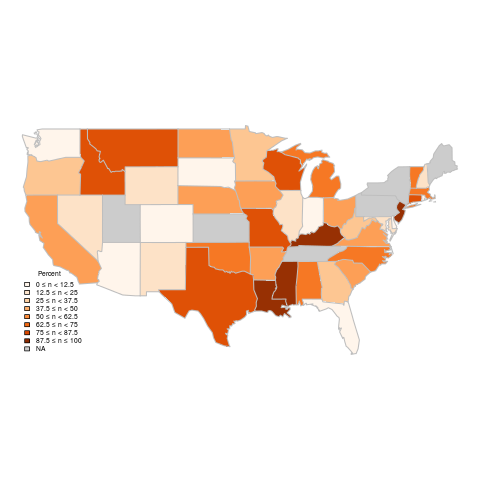
The new map (see map-new-legend.R) meets all the criteria we started with that the original legend didn't have.
Code is available in a gist.
# map data:
map("state", # base
  col = "gray80",
  fill = TRUE,
  lty = 0)
map("state", # data
  col = colcode,
  fill = TRUE,
  lty = 0,
  add = TRUE)
map("state", # border
  col = "gray",
  lwd = 1.4,
  lty = 1,
  add = TRUE)
And finally let's add our default legend:
legend("bottomleft", # position
  legend = names(attr(colcode, "table")),
  title = "Percent",
  fill = attr(colcode, "palette"),
  cex = 0.56,
  bty = "n") # border
Here's the output of this code (see map-standard-legend.R in the gist):
 |
| Percent of power coming from coal sources (standard legend) |
Custom Legend
Next we want to add a few lines here and there to enhance the legend.For starters, let's deal with NA values. We don't have any in this particular dataset, but if we did, we would have seen they were left as the base color of the map and not included in the legend.
After our former code setting up the colors, we should add the color for NAs. It's important that these lines go after all the other set up code, or the wrong colors will be mapped.
# set up colors:
plotclr <- brewer.pal(nclr, "Oranges")
plotvar <- state$coal
class <- classIntervals(plotvar,
  nclr,
  style = "fixed",
  fixedBreaks = seq(min, max, breaks))
colcode <- findColours(class,
  plotclr)
NAColor <- "gray80"
plotclr <- c(plotclr, NAColor)
We also want to let the map know to have our NA color as the default color, so the map will use that instead of having those areas be transparent:
# map data:
map("state", # base
  col = NAColor,
  fill = TRUE,
  lty = 0)
map("state", # data
  col = colcode,
  fill = TRUE,
  lty = 0,
  add = TRUE)
map("state", # border
  col = "gray",
  lwd = 1.4,
  lty = 1,
  add = TRUE)
Next, we want to set up the legend text. For all but the last interval, we want it to say i ≤ n < (i + breaks). The last interval should be i ≤ n ≤ (i + breaks). This can be accomplished by
# set legend text:
legendText <- c()
for(i in seq(min, max - (max - min) / nclr, (max - min) / nclr)) {
  if (i == max(seq(min, max - (max - min) / nclr, (max - min) / nclr))) {
    legendText <- c(legendText, paste(round(i,3), "\u2264 n \u2264", round(i + (max - min) / nclr,3)))
  } else
    legendText <- c(legendText, paste(round(i,3), "\u2264 n <", round(i + (max - min) / nclr,3)))
}
But we also want to include NAs in the legend, so we need to add a line:
# set legend text:
legendText <- c()
for(i in seq(min, max - (max - min) / nclr, (max - min) / nclr)) {
  if (i == max(seq(min, max - (max - min) / nclr, (max - min) / nclr))) {
    legendText <- c(legendText, paste(round(i,3), "\u2264 n \u2264", round(i + (max - min) / nclr,3)))
    if (!is.na(NAColor)) legendText <- c(legendText, "NA")
  } else
    legendText <- c(legendText, paste(round(i,3), "\u2264 n <", round(i + (max - min) / nclr,3)))
}
And finally we need to add the legend to the map:
legend("bottomleft", # position
  legend = legendText,
  title = "Percent",
  fill = plotclr,
  cex = 0.56,
  bty = "n") # border
The new map (see map-new-legend.R) meets all the criteria we started with that the original legend didn't have.
 |
| Percent of power coming from coal sources (custom legend) |
Code is available in a gist.
No comments:
Post a Comment